The highest-paying city in America is not the best-paying place to live. That sounds like a contradiction until you put wages and living costs side by side: a large paycheck in an expensive metro can leave less in hand than a modest one somewhere affordable. To find where an ordinary American paycheck actually goes furthest, we took the typical wage in every major US metro and adjusted it for local cost of living.
How we did it
For the wage measure, we used the BLS OEWS "All Occupations" figure (SOC 00-0000) - the true across-the-board median wage for every worker in a metro, not one profession. It's available for every metro with a population of at least 150,000, the same threshold used across this site, which gives a ranking of 150 metros with no gaps to fill with a workaround.
For the cost side, we used the same rent-based index this site uses everywhere: local median rent relative to the median rent across those 150 metros, with the typical metro set to 100. We divided each metro's typical wage by its cost index and multiplied by 100 to get the adjusted value - what that wage is worth in average-cost-of-living dollars: adjusted value = typical wage × 100 ÷ cost index.
One methodology detail worth stating plainly: the index is capped between 70 and 200. Only one metro here hits that ceiling - San Jose, whose uncapped index would run above 215; capped at 200, it's still the highest in the ranking. A handful of the cheapest metros sit at the 70 floor. We use the same capped values the rest of this site uses on every page.
Two more honest caveats. Our cost index is built on local rent - the single largest cost-of-living difference between metros - so it captures housing well but doesn't fully price in groceries, utilities, taxes, or transport. And a metro-wide typical wage says nothing about your specific job: what you personally earn depends on your occupation, experience, and employer, not just your zip code. Our guide on cost-of-living indices explains how the index works.
Where a paycheck goes furthest
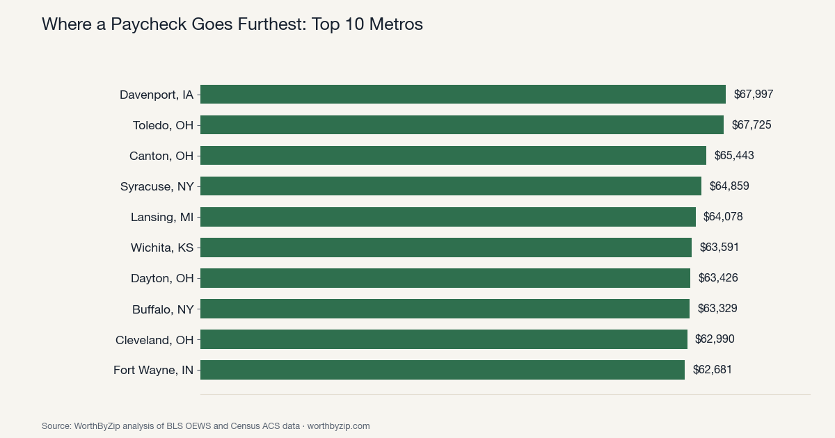
Ranked by cost-adjusted typical wage, not by raw pay:
| Rank | Metro | Typical wage | Cost index | Adjusted value |
|---|---|---|---|---|
| 1 | Davenport, IA | $48,550 | 71.4 | $67,997 |
| 2 | Toledo, OH | $48,220 | 71.2 | $67,725 |
| 3 | Canton, OH | $45,810 | 70.0 | $65,443 |
| 4 | Syracuse, NY | $52,990 | 81.7 | $64,859 |
| 5 | Lansing, MI | $52,800 | 82.4 | $64,078 |
| 6 | Wichita, KS | $47,630 | 74.9 | $63,591 |
| 7 | Dayton, OH | $49,980 | 78.8 | $63,426 |
| 8 | Buffalo, NY | $50,790 | 80.2 | $63,329 |
| 9 | Cleveland, OH | $50,140 | 79.6 | $62,990 |
| 10 | Fort Wayne, IN | $47,700 | 76.1 | $62,681 |
The Rust Belt and the Midwest own this list. Four of the ten metros - Toledo, Canton, Dayton, and Cleveland - are in Ohio alone, and the rest are scattered across the same broader region: Iowa, New York, Michigan, Kansas, Indiana. None of these metros pay a remarkable nominal wage; what they share is rent well below the national metro median, in the 70-82 range on our index. Davenport, Iowa takes the top spot outright - a $48,550 typical wage that isn't unusual anywhere in the country, paired with the second-lowest cost index in the entire ranking, worth $67,997 in average-cost-of-living terms once adjusted. That's not a fluke of one cheap metro; it's the same formula repeating across an entire region.
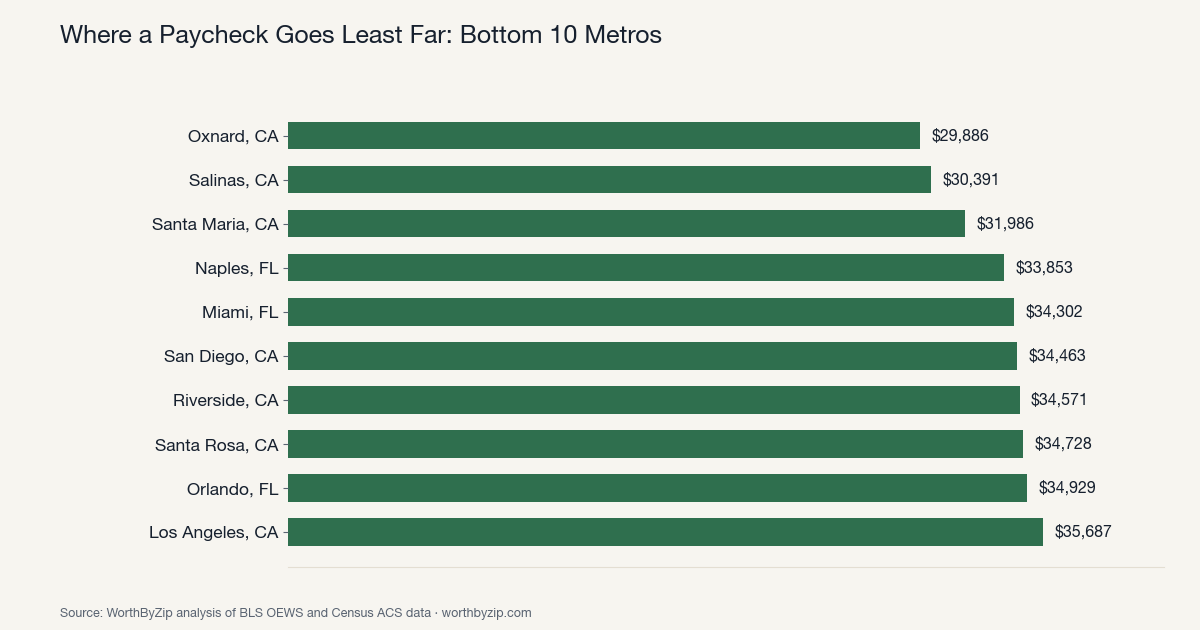
Where it goes least far
| Rank | Metro | Typical wage | Cost index | Adjusted value |
|---|---|---|---|---|
| 150 | Oxnard, CA | $52,510 | 175.7 | $29,886 |
| 149 | Salinas, CA | $47,380 | 155.9 | $30,391 |
| 148 | Santa Maria, CA | $51,690 | 161.6 | $31,986 |
| 147 | Naples, FL | $47,800 | 141.2 | $33,853 |
| 146 | Miami, FL | $48,640 | 141.8 | $34,302 |
| 145 | San Diego, CA | $58,690 | 170.3 | $34,463 |
| 144 | Riverside, CA | $48,400 | 140.0 | $34,571 |
| 143 | Santa Rosa, CA | $56,850 | 163.7 | $34,728 |
| 142 | Orlando, FL | $46,630 | 133.5 | $34,929 |
| 141 | Los Angeles, CA | $55,850 | 156.5 | $35,687 |
Seven of the bottom ten are California metros, and the other three are Florida. The pattern is a mirror image of the top: typical wages here aren't dramatically low - Los Angeles's $55,850 and San Diego's $58,690 are both above the national middle of this dataset - but rent running 33% to 76% above the metro median erases the advantage and then some. Oxnard, the metro at the very bottom, pays a typical wage of $52,510 - above most of the top-10 list - but lands last purely because its cost index (175.7) is more than double what those Rust Belt metros carry.
Big salaries don't always win
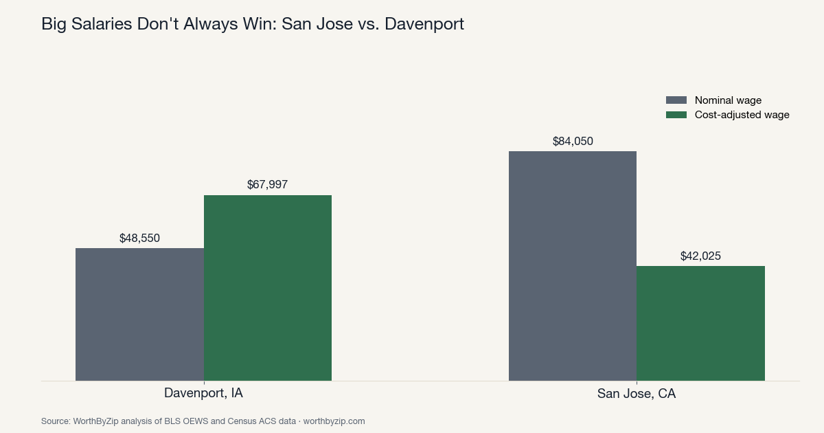
The clearest illustration is a head-to-head: San Jose versus Davenport. San Jose has the single highest typical wage in this dataset, $84,050 - nearly double Davenport's $48,550. But San Jose's cost index is 200, the highest in the ranking (capped, as explained above), which brings its adjusted value down to $42,025. Davenport's adjusted value, $67,997, is nearly $26,000 higher - the "smaller" paycheck buys meaningfully more.
The reason is structural, not incidental: typical wages vary between metros by a factor of maybe 2x at the extremes, but rents vary much more sharply - San Jose's median rent ($2,840) is roughly three times Davenport's ($941). When cost of living swings that much harder than pay does, cost of living usually decides the outcome. The gap between the single best and worst metro here, Davenport ($67,997) and Oxnard ($29,886), is $38,111 in real buying power on a typical paycheck - more than the entire typical wage in either metro.
This is the same pattern we found looking at individual professions. Our studies on where a nurse's salary stretches furthest and where a teacher's salary stretches furthest both found that the metros paying the biggest headline salaries were rarely the ones where workers came out ahead.
What this means for you
Judge a job offer or a relocation by cost-adjusted pay, not the number on the offer letter - a lower salary in an affordable metro can leave you better off than a higher one in an expensive city, and this study shows how large that gap can get at the extremes. That said, don't treat cheap rent as the only variable: the most affordable metros here tend to have smaller, less dynamic job markets than the expensive coastal ones, so weigh job availability and career trajectory alongside the math.
To check your own situation, use our salary calculator to convert a salary between any two US metros, and look up what your occupation actually pays locally - for example registered nurses or software developers. Our guide on nominal vs. real wages explains the underlying idea in more detail.
The takeaway
The best-paying metros in America and the best metros to be paid in are largely different places. Davenport, Iowa - a metro most people couldn't place on a map - beats San Jose, the highest-paying metro in the country, on real buying power. And the spread between the best metro for a typical paycheck, Davenport, and the worst, Oxnard, comes to $38,111 - a gap wide enough to change what a perfectly ordinary salary actually means for the life it buys.
Using this research
- Download the full ranking (CSV, 150 metros)
- Chart: top 10 metros by cost-adjusted pay (PNG)
- Chart: bottom 10 metros by cost-adjusted pay (PNG)
- Chart: San Jose vs. Davenport, nominal vs. adjusted pay (PNG)
The full ranking is available as a CSV, and the charts are free to republish. Attribution is appreciated but not required - if you'd like to credit us: "Source: WorthByZip analysis of BLS OEWS and Census ACS data." Happy to pull figures for a specific metro or occupation on request: info@worthbyzip.com